Another week, another usability review. This week, I have chosen to tackle the coffee machine we have at home, the De’Longhi Magnifica-S. Since this is the machine I have been using for the past month, the usability test focuses on my experience as a daily user. That being said, there are still some functionalities that I am apprehensive about and have yet to figure out.
I chose to conduct this analysis based on the Nielsen Norman Group usability heuristics because they have always been a good starting point for me.
Usability Heuristics
Visibility of The System:
Reflection Questions:
Q1: How much of the process should the user be aware of?
When I think of the visibility of the system, I think about two things: the user flow, the steps the user wants to take, and its visibility, as well as how well the system communicates to the user.
I drew the interaction zones on the De’Longhi machine. Breaking down the movable parts to see how clear it is that the intended action is done. Are the signals clear enough?
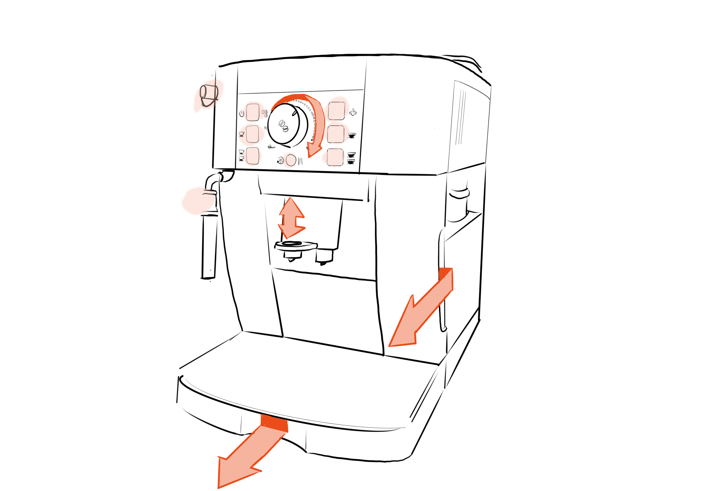
Interaction Types- Communication through Form
| Interaction Type | Signal | Where on the machine & Functionality |
| Grab and Pull | Indentation acts like a handle, with clear split lines. | Water tank to the right, coffee ground holder at the bottom, to help remove parts of the machine. |
| Turn | knob with indent, dots around the knob, written Min-Max | At the top of the machine by the coffee selection, to adjust the strength of coffee. |
| Pull up and down | Thumb indentation and extruded part acting like a handle. | In the middle of the machine to help adjust to different cup heights. |
| Push button | Black buttons, raduis and split line with indentation around button. | Selecting the coffee type and turning on the machine. |
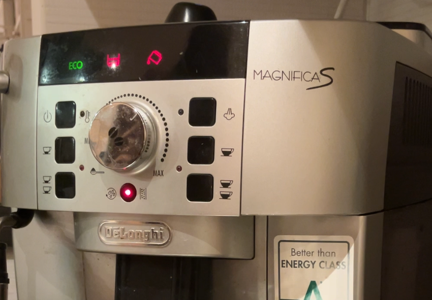
Communication through Symbols
Apart from communicating through shape, a system can communicate through symbols.
The De Longhi MagnificaS communicates through;
- Temporary Symbols: symbols on the display screen to indicate urgent actions to take.
- Permanent Symbols; Actions: Symbols that indicate actions users can take, such as a coffee symbol.
- Process Symbols: Symbols that show the process of the machine. For example, the light next to the thermometer symbol turns on when the machine is heating up. The thermometer symbol allows the system to communicate with the user.
| PRO | CON |
| – The form does follow function and uses a lot of clear interactive elements. | – The temporary symbols require learning. – The symbols are not accesible, They do not have text to help interpret the symbol. Additionally they do not have any texture so people who are visually impaired may find it difficult. |
Match between the system and the real world:
Reflection Questions:
Q2: What decides what is considered normal for the real world?
To analyse the match between the system and the real world, I look at normal mapping.
| PRO | Improvement potential |
| – The symbols that indicate more coffee show more coffee. | – I would switch the steam button and the on button so that the steam button is close to the steamer on the left. |
User control and freedom:
| PRO | CON |
| – It is difficult to undo when having pressed coffee button incorrectly. |
Consistency and Standards:
I have not delved into the consistency and standards fully.
| PRO | CON |
| – The containers, where to fill water, fill beans, and empty coffee grounds is the same as most competitors aligning it with external consistency. | – Some of the symbols are not consistent or clear, requiring users to learn the meaning of the symbol. |
Aesthetic and minimalist design
Reflection Questions:
Q3: To what degree can we reduce noise on a home use coffee machine?
Q4: How do we create machines that communicate their needs while embracing the visual aesthetic of the home?A machine used at home can be quite simple and a lot of noise can be reduced since the novice user quickly becomes an expert when the machine is used every day. This means that the user barely has to look at the machine to know which buttons to click. These users may not need as many queues as the relationship between the user and product grows. However the error messages are important to maintain ensure proper care of the machine.
| PRO | CON |
| – There are only a few functions on the machine therefore only a few buttons. | – There is no text or sound when there is an error message. This can be a pro and a con. |
Thank you for making it this far! I am trying to learn and grow as a designer; however, because of the limited time I am giving myself for these analyses, they will continue to be more towards the shallow side.
The interesting thing is how quickly I started seeing more coffee machines around me and how their display or symbols used differed. For example, I was at a physiotherapist’s office that has a coffee machine for the guests. Where they had to put a how to use the machine above the machine to help guests use it correctly. Which made me think, are there any machines that are completely self-explanatory? Can we, as designers, remove all barriers for novice users? I don’t think so. It was fascinating to see how two similar machines were so different solely based on the context of use, experts vs. novice users.
Next week, I will continue by analysing a digital tool.

Leave a comment